


Giving the Checkerboard New Life: Color Pairings Worth Exploring
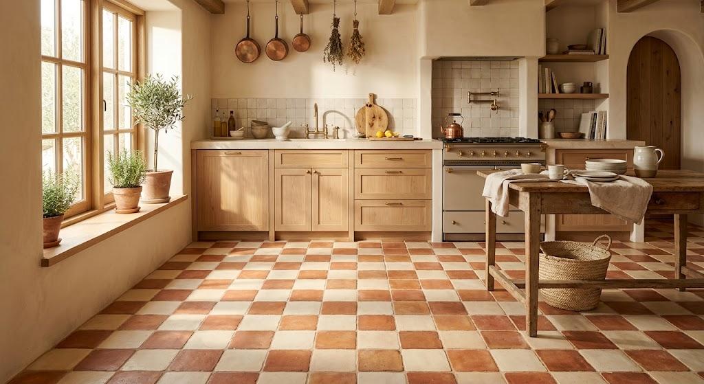
There is a reason the checkerboard floor keeps coming back. The alternating grid is one of the simplest ways to create visual movement across a flat surface. It introduces order, rhythm, and contrast with nothing more than two colors and a repeating layout. For most of its modern history, those two colors have been black and white.
That combination is iconic, but icon status can calcify into habit. The checkerboard does not owe its longevity to any specific palette. It owes it to the underlying geometry. When you pair that geometry with colors chosen for the specific mood of a room, the result stops looking like a default choice and starts looking like a deliberate one.
The Weight of Tradition
There are settings where black and white remains the ideal answer. A formal entryway with high ceilings and architectural detail can handle the visual drama. A vintage kitchen with period-appropriate fixtures benefits from the historical continuity. In these rooms, the extreme contrast amplifies existing character rather than competing with it.
But in the majority of modern homes — rooms with clean lines, neutral furnishings, and modest proportions — that same contrast can feel disconnected. It introduces a level of visual tension that the rest of the space is not built to support. Pulling back from full contrast and introducing color allows the floor to sit naturally within the room. The pattern retains its energy, but the atmosphere becomes cohesive.
Terracotta and Cream
Warmth is the defining quality of this pairing. Terracotta carries the look and feel of clay straight from the kiln — a color that has lined floors for millennia across the Mediterranean and beyond. Cream softens the combination, preventing the checkerboard from feeling heavy or dark. Together they produce a surface that radiates quiet warmth.
This works exceptionally well in rooms that see daily use. A kitchen, a hallway, a mudroom — these are spaces where warmth underfoot changes how the room feels. The slight variation in tone from one terracotta tile to the next keeps the pattern lively and organic. Visiting a ceramic tile shop gives you the chance to see and compare these natural variations in person, which matters more with earth-toned materials than with any other category. Glazed terracotta offers the same look with easier cleanup, while unglazed options deliver a rawer, more tactile surface.
Deep Navy and White
If black feels too absolute, navy offers a more nuanced darkness. It anchors a room with authority but without the finality that black sometimes brings. Set against white, navy creates a checkerboard that is clean and structured yet slightly more relaxed than its monochrome predecessor.
This pairing is a natural fit for bathrooms, laundry rooms, and entryways — spaces where cleanliness and brightness both matter. The navy tile absorbs the marks and scuffs of daily life. The white tile reflects light and keeps the room from feeling enclosed. Navy and white mosaic floor tiles are a practical solution for these smaller rooms, where a tightly set pattern helps define the floor plane. Minimal wall treatments and simple metal hardware are all the pairing needs to feel complete.
Sage Green and Off-White
The appetite for green in interiors continues to grow, and sage has emerged as the variety with the broadest appeal. It is earthy without being dark, colorful without being loud. Against off-white, it creates a checkerboard that feels gentle and unbroken — two soft tones flowing into one another rather than striking against each other.
Off-white is the critical choice here. Pure white would create a sharper break between tiles, fragmenting the floor into distinct blocks. Off-white maintains continuity. The effect is something closer to a woven mat than a rigid grid. This palette fits well in rooms that serve a practical purpose but deserve aesthetic attention — pantries, powder rooms, and laundry areas. The floor in these spaces often goes unconsidered, and this pairing rewards the effort of choosing deliberately.
Mustard Yellow and Charcoal
Not every room calls for subtlety. Mustard yellow is warm, rich, and impossible to ignore. Charcoal acts as the anchor, absorbing the intensity and preventing the combination from tipping into visual overload. The checkerboard format contains the yellow within defined boundaries, giving it shape and discipline.
Scale and context determine success with this pairing. In a large living area, the effect can be too much — the color competes with furnishings and demands constant attention. In a smaller space — a hallway, a guest bath, a compact entryway — it becomes a defining feature that gives the room its identity. The grid organizes the energy. The color provides the spark. Together they create a floor that is both structured and expressive.
Dusty Rose and Soft Gray
Some design choices announce themselves loudly. This one does not. Dusty rose is a muted, warm pink that behaves more like a neutral than a color. Set against soft gray, it produces a checkerboard of extremely low contrast — a pattern that is felt more than seen.
This subtlety is precisely its strength. In a bedroom, it creates warmth without stimulation. In a walk-in closet or dressing area, it adds a layer of refinement. In an open living space, it provides a continuous ground plane that connects different areas without visual interruption. The floor recedes into the architecture rather than sitting on top of it. It is a mature selection — one that favors quiet satisfaction over immediate attention.
Making It Work: Practical Considerations
Match Material to Demands
Every room places different demands on its floor. Wet areas like bathrooms and mudrooms need tiles with low water absorption. Dense porcelain handles these conditions better than standard ceramic. Dry areas — bedrooms, living rooms, hallways — have fewer constraints, and lighter ceramic may suffice. When evaluating options at a ceramic tile shop, pay attention to the PEI rating, which measures a tile's resistance to surface wear. Higher ratings indicate greater durability. Choosing the right material for the specific room will prevent premature wear and reduce long-term maintenance.
Grout Shapes the Result
The thin line between tiles is not a minor detail. It is a design element with real visual impact. With a checkerboard, grout either supports the pattern or undermines it. A neutral grout that sits between the values of the two tile colors keeps the grid uniform and lets the color pairing speak for itself. A darker grout adds vintage character and masks dirt but darkens the overall impression. A lighter grout keeps the floor feeling airy but shows stains more quickly. Whatever your preference, the grout should complement both tile colors equally. Decide on grout as part of the initial design, not as an afterthought at the end of the project.
Bring Samples Into Your Home
No showroom can replicate the lighting conditions of your actual space. Store environments use bright, even illumination that presents every tile in its best light. Residential rooms are more variable. A north-facing kitchen bathes the floor in cool light for most of the day. A south-facing bathroom amplifies warm undertones in ways the store never showed you. A room with recessed ceiling lights will cast different shadows than one with a central pendant. Place your tile samples on the floor of the actual room and observe them through the full cycle of daylight and artificial light. This single step prevents more regret than any other part of the selection process.
Tile Size Affects Perception
The physical dimensions of each square change how the pattern communicates. Larger tiles — ten to twelve inches — produce a bold, modern checkerboard with fewer grid lines. The floor feels open. Smaller tiles, particularly the two- and three-inch squares common when you buy mosaic floor tiles, create a denser, more textured surface. They feel traditional and European. The right choice depends on room scale. A spacious room can accommodate large tiles without losing visual interest. A small bathroom benefits from a tighter grid that adds detail and complexity to a limited area.
Installation Demands Discipline
A checkerboard is among the most exacting patterns to install correctly. The entire effect depends on precise alignment. A row that drifts slightly off course, a grout line that varies in width, or a pattern that does not center properly within the room — these issues become immediately visible when two colors alternate in a strict grid. A single-tone floor conceals such imperfections. A checkerboard exposes them. The most important installation step is the dry lay, where tiles are placed across the full room without adhesive. This reveals where cuts fall, whether the pattern balances within the space, and how the two colors interact at full scale. Allocate enough time for this step. It is the difference between a floor that looks professional and one that looks amateur.
The Pattern Is Ready for New Colors
The checkerboard has earned its place in design history not because of black and white, but because of what the alternating grid accomplishes. It creates movement, establishes order, and transforms a flat surface into something with depth and rhythm. Those qualities belong to the pattern itself, independent of any color tradition.
By choosing terracotta over black, sage over white, or mustard over charcoal, you retain everything that makes the checkerboard effective while stripping away the assumption that it must look a certain way. The floor becomes a considered choice — a surface shaped by personal preference rather than inherited convention. That is the difference between a floor that merely covers the ground and one that genuinely defines the room above it.

 English
 Arabic
 French
 Spanish
 Portuguese
 Deutsch
 Dutch
Dutch
 Italiano
 Russian
 Romaian
 Portuguese (Brazil)
 Greek
Greek
 ไทย
ไทย